ANIME

Fast Facts (dataset scope + what it implies)
This MyAnimeList dataset covers 13,631 unique anime titles spanning 1917 to 2019, which makes it closer to a century-scale archive than a “modern seasonal TV” snapshot. That scope is powerful because it lets you describe anime as an industry that changes structurally over time—how output shifts across formats, how distribution expands, and how the catalog grows from early historical animation into a modern high-throughput ecosystem. At the same time, the long horizon also means the dataset includes many niche or archival entries (shorts, early films, obscure OVAs/ONAs) that behave differently from todayʼs mainstream TV hits—so itʼs important to separate “catalog reality” from “fan-canon popularity.”
The format breakdown shows that TV is the largest single category but not the majority of the dataset. TV accounts for 4,260 titles (31.3%), followed by Movies (2,657; 19.5%), OVAs (2,378; 17.4%), Specials (2,003; 14.7%), ONAs (1,321; 9.7%), and Music (1,011; 7.4%). In other words, most titles in the archive are non-TV, which matters for interpretation: later charts about scores, popularity, or studios are not only describing TV anime—theyʼre describing a mixed system where theatrical releases, direct-to-video, specials, and web originals represent a huge share of the total catalog.
On ratings, the dataset baseline is modest: the overall median MAL score is 6.38 (mean 6.29, standard deviation ~1.10). Thatʼs a useful benchmark for everything that follows. When you rank studios or genres, the real question isnʼt “whoʼs above 8,” itʼs “who can stay consistently above 6.38 across a meaningful number of titles?” It also frames a clean narrative truth about rating platforms: most entries sit in a middle band, and “greatness” is a relatively thin slice of the distribution.
The “top titles” lists reveal three different definitions of “best,” and they donʼt fully overlap: highest rated (prestige), largest audience (members), and most favorited (intensity/attachment). The biggest-audience list is dominated by mainstream hits—Death Note, Attack on Titan, Sword Art Online, One Punch Man, Tokyo Ghoul—which represent maximum reach rather than maximum score. Meanwhile, the top favorites list strongly overlaps with the prestige canon (Fullmetal Alchemist: Brotherhood, Steins;Gate, Hunter x Hunter (2011)), showing that favorites capture something closer to “devotion” than raw scale. One important caveat: the raw top-rated list also surfaces several tiny-audience edge cases with extremely high scores (including perfect 10s with very low member counts). Those are real entries, but theyʼre also a reminder that ratings can be unstable at very low engagement—so later comparisons should either note that explicitly or include a “top-rated with meaningful audience” threshold when you want prestige that general readers recognize.
Finally, the longest-running title is a perfect counterexample to the idea that “more episodes = better.” The datasetʼs maximum episode count is 3,057 episodes (Lan Mao, TV), with a score around 5.64 and a small member count. Thatʼs a clean thesis anchor: longevity is often an industrial scheduling outcome (kidsʼ programming, long domestic serials, evergreen formats), not a signal of universal acclaim. It sets up one of the best through-lines for the newsletter: anime has multiple “axes of bigness”—long-running, widely watched, highly rated, and most beloved—and the dataset lets you show how those axes diverge instead of treating them as the same thing.
Chart 1 — Anime releases per year by type (line chart)
This chart shows anime transforming from a low-volume, film-anchored medium into a modern multi-pipeline industry. In the early decades, Movies are the main visible output channel: production exists, but itʼs sparse and irregular, consistent with an era where animation output is driven by studios making shorts/films rather than an always-on serial TV system. The long flat baseline across most formats isnʼt “no anime existed”—itʼs that the catalog is thin, distribution is constrained, and the industry hasnʼt yet evolved into a standardized pipeline that can ship dozens or hundreds of titles a year.
The first real regime shift appears in the late 1980s into the early 1990s, where OVA output spikes sharply. That pattern is historically coherent: OVAs function as the “home video boom” format—direct-to-consumer, less constrained by TV schedules, and often used for higher-risk, niche, or premium projects. The key point is that OVAs arenʼt just a format; theyʼre evidence of a distribution change. And the chart shows their role clearly: OVAs surge when home video becomes a major channel, then stabilize and gradually decline as the market structure changes again.
The modern industrial takeoff is the late 1990s through the 2010s, and itʼs not driven by one format—itʼs driven by multiple pipelines scaling at once. TV becomes the core throughput engine, accelerating especially in the 2000s and then steepening again in the 2010s. This is the era of the standardized seasonal production model: repeatable cours, committee financing, and a globalized distribution environment that makes high-volume TV output economically viable. At the same time, Specials rise hard in the 2000s–2010s, which fits how franchises maintain engagement outside the strict TV-season cadence (bonus episodes, recaps, spinoffs, promotional releases, one-off tie-ins). Specials behave like a flexible “support channel” that expands as the broader franchise ecosystem expands.
The most important late-era signal is ONA. Itʼs basically nonexistent for most of the timeline and then explodes in the 2010s, indicating a clean structural shift: web-first distribution becomes a real production lane rather than an exception. ONAs reflect platform dynamics—digital release, shorter cycles, different episode structures, and a lower barrier to shipping content. In your story, ONAs are the signature of the “platform era,” where the industry doesnʼt just scale output; it diversifies the ways content gets released.
Finally, the Music facet ramps late and fast, which likely reflects both real growth (more music videos, promotional shorts, and digital releases tied to franchises) and a cataloging effect: modern web ecosystems capture and index these small-format releases more completely. Because Music is lower-count, itʼs naturally more volatile year-to-year, but its late rise reinforces the same macro thesis as ONA: the 2010s arenʼt only more anime—theyʼre more formats and more release types being produced and tracked.
The headline takeaway: animeʼs growth is best described as industrialization + diversification. TV is the backbone of scale, OVAs mark the home-video boom, and ONAs mark the digital platform shift—while Movies and Specials grow as parallel channels in a franchise-driven market. This chart sets up the rest of your newsletter: once the industry enters a high-throughput, multi-channel era, you should expect downstream changes in audience size, rating dynamics, studio behavior, and the economics of what gets produced.
Chart 2 — Hit-rate of high-scoring titles by format (8+, 8.5+, 9+)
This chart answers a brutally practical viewer question: “If I pick a title at random in this format, what are the odds itʼs actually great?” Instead of comparing average scores (which often compress differences and hide the “elite tail”), youʼre measuring hit-rate—the share of titles that clear an “Iʼd recommend this” threshold. Here that threshold is 8+, with 8.5+ and 9+ included as progressively rarer “prestige tiers.” In other words, this is not “which format is best in theory,” itʼs which format is most likely to deliver a win per click.
The first headline is clear: TV is the highest-yield hunting ground for 8+ titles in your dataset. About 8.2% of TV titles are rated 8+ (346 out of 4,240), which is meaningfully higher than every other format. The next closest is Movies at 4.8% (128/2,640), then OVA at 3.0% (70/2,348), Special at 2.1% (41/1,996), ONA at 1.2% (16/1,308), and Music at 0.2% (2/985). Read that as a simple “random-pick expectation”: out of 100 picks, TV gives you ~8 hits, Movies ~5, OVAs ~3, Specials ~2, ONAs ~1, and Music basically ~0. Thatʼs why this chart feels so intuitive—itʼs probability, not vibes.
What makes TVʼs lead especially important is that itʼs not just “TV has more titles.” Youʼve already normalized by format. TV is winning on rate, meaning something structural is happening: TV isnʼt only the main output pipeline, itʼs also where the ecosystem concentrates more of its top-rated catalog. This matches how modern anime is consumed and remembered. TV series are the default format for cultural momentum: weekly release cycles, long-form character investment, sustained fandom discussion, and franchise reinforcement all create the conditions for certain shows to become consensus favorites. If Chart 1 showed TV as the industrial “throughput engine,” Chart 2 shows TV as the highest-yield engine for top-end audience approval.
Movies are the interesting second-place result because people often assume films are the prestige lane. But the chart reveals the economic reality of the “Movie” bucket: itʼs not pure prestige—itʼs a mixed market. Some films are masterpieces, but many are smaller releases, franchise extensions, compilations, side stories, or titles with narrower reach. That mix drags the hit-rate down relative to the romantic idea of “anime films = premium.” Still, Movies clearly outperform OVAs and Specials on 8+ share, which suggests that when a film does land, it often lands with enough impact to clear the “high score” threshold—just not as consistently per random pick as TV.
The OVA result is historically coherent too. OVAs are a format born from a different distribution logic—home video, niche targeting, experimentation, and sometimes premium animation budgets—so you might expect them to punch above their weight. But as a bucket, OVAs include both cult classics and a lot of “deep catalog” material that never becomes broadly celebrated. The chart reflects that: OVAs can absolutely produce standout titles, but the probability of hitting an 8+ is lower than Movies and much lower than TV. In your larger narrative, OVAs are a reminder that format innovation doesnʼt automatically translate into mass approval—it creates a wider range of outcomes.
Specials and ONAs function like “secondary lanes,” and the hit-rates reflect that. Specials are often support content—bonus episodes, recaps, tie-ins, franchise maintenance—so the formatʼs job isnʼt necessarily to produce the most iconic works; itʼs to extend attention and fill gaps between major releases. That makes a lower hit-rate logical. ONAs are web-first and extremely heterogeneous: some are top-tier originals, many are short-form experiments, promotional releases, or platform-driven projects where production constraints and distribution priorities differ from TV. So the ONA line reads like a platform-era pattern: more content, faster cycles, wider variance, lower probability that any one title becomes a universally “elite-rated” hit.
The “rarity ladder” (8.5+ and 9+) is where the story gets even sharper. Even in the best-performing format (TV), 8.5+ is only 1.9% (81/4,240) and 9+ is only 0.3% (11/4,240). Thatʼs the quiet truth the chart exposes: masterpiece-level scores are rare in every format. The point isnʼt that “TV produces tons of 9+ shows”—it doesnʼt. The point is that TV gives you the best odds in a world where truly elite titles are scarce everywhere. Movies show 0.9% at 8.5+ and 0.2% at 9+, which supports a “prestige exists but is rare” interpretation. OVAs, Specials, and ONAs barely register at the very top, which again fits how these formats operate: they expand the ecosystem, but fewer titles become universal consensus classics.
Your table adds a second, crucial context layer: the median score baseline. TV not only has the best 8+ hit-rate; it also has the highest median score (6.79), meaning the entire TV distribution is shifted upward relative to other formats. Movies and OVAs sit at 6.30, Specials at 6.44, ONA at 5.69, and Music at 5.19. This matters because it means TV isnʼt just winning because it creates more “hits”—itʼs winning because the typical TV title is rated higher too. If Chart 1 framed the 2000s–2010s as the era of standardized seasonal production, this chart suggests that the same industrial system also generates more consistent audience satisfaction—not necessarily perfection, but fewer titles falling into the low-confidence zone.
Translation of key terms (for non-analysts): Hit-rate = your odds of getting something good if you pick randomly. 8+ = “strong recommend” (not perfect, but clearly high quality). 8.5+ = “exceptional” (standout, above the already-good tier). 9+ = “rare classic” territory (very few titles reach it). Median = the middle score; half the titles are higher, half are lower. n (sample size) = how many titles were in the dataset for that format.
The headline takeaway: this chart supports a “viewerʼs strategy” thesis: if you want the best odds of finding an 8+ title quickly, TV is the most efficient format to browse. Movies are second-best but more mixed; OVAs can be gems but are less consistently high-rated; Specials and ONAs behave like ecosystem support lanes; and Music is mostly not rated like a full narrative format, so it rarely clears high-score thresholds. In your newsletter arc, Chart 2 pairs cleanly with Chart 1: once anime becomes a high-throughput, multi-pipeline industry, TV remains the primary lane where audience consensus and top-end ratings concentrate, even as the platform era expands other release types.
Chart 3 — Popularity rank vs score (log scale)
Popularity on MyAnimeList is, in effect, an attention register—a rank that largely tracks how many people have added a title to their lists (membership), not whether it is “objectively” great. (Kaggle) Your decile chart turns that attention register into a clean map: within the top 12,000 popularity ranks, the median score slides from 7.73 in D1 (most popular) to 5.75 in D10 (least popular)—almost a two-point drop. The “elite” zone becomes rare with startling speed: 34.4% of D1 titles score 8+, but that falls to 12.4% in D2, 5.5% in D3, and is effectively near-zero through much of the bottom half of the distribution. In museum terms, the front gallery does not contain all the masterpieces—but it contains a far higher concentration of them, while the back rooms swell with competent craft, unfinished experiments, forgotten commissions, and work that never acquired an audience large enough to stabilize its reputation.
Cultural economics has a familiar explanation for why the front gallery looks “better.” In markets where consumption can be shared at scale—one TV series can be watched by millions, one reputation can be copied by millions—small differences in perceived quality or early traction can produce superstar outcomes. Sherwin Rosenʼs classic model shows how scalable consumption and imperfect substitution create winner-take-most dynamics: audiences cluster around a handful of titles that become the default choices, not because everything else is bad, but because attention is scarce and coordination is valuable. (University of Chicago Home Page) In an information-rich world, Herbert Simon argued, the limiting resource is not information but attention; abundance creates a “poverty of attention,” forcing audiences to rely on shortcuts—rankings, lists, social proof—to allocate time. (Oxford Reference) Your chart is that scarcity, rendered numerically: as popularity thins, the probability of encountering a widely endorsed “8+” title collapses, because fewer people see the work, finish it, rate it, and keep it alive in the collective memory.
The more subtle point is that popularity does not simply reflect quality; it also manufactures it through feedback. Social influence can create cumulative advantage (the “Matthew effect”), where early visibility begets more visibility, and outcomes become both more unequal and more path-dependent. (Wikipedia) Salganik, Dodds, and Watts demonstrated this experimentally in a controlled “music market”: when participants could see what others chose, hits became more concentrated and outcomes more unpredictable—success depended not just on intrinsic appeal but on the social signal itself. (Princeton University) That logic fits the decile gradient you observe: high-attention titles are reviewed by more people and are more likely to accumulate the kind of broad consensus that produces stable, high medians, while low-attention titles remain statistically fragile—more variance, more noise, more “unseen” quality, and more work that never gets enough exposure to earn a durable reputation.
Seen this way, your chart is not a verdict on taste; it is a tour through an attention economy with a long tail. Digital culture promises infinite shelves—more releases, more niches, more micro-audiences—but shelves do not guarantee foot traffic. (WIRED) The deciles show that the head of the distribution functions like a curated exhibit: fewer titles, higher typical scores, and a meaningful chance of “masterpiece” ratings. The tail is the archive: vast, uneven, and often under-visited. For readers, the practical takeaway is crisp: popularity is a strong signal of higher average ratings, but it is also a mechanism that concentrates attention. If you want reliably high-scoring picks, you shop near the entrance; if you want discovery, you walk deeper into the stacks—accepting that the expected score falls even as the chance of finding something idiosyncratic rises.
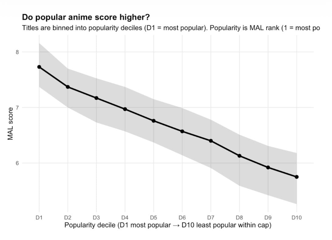
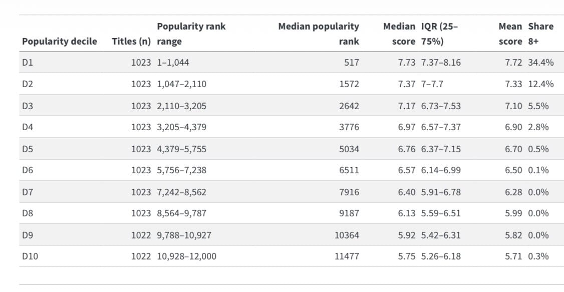
Chart 4 — Episodes vs score (log scale)
This chart answers a deceptively hard question—which studios “score highest” on MyAnimeList—by using median score (the typical title) instead of averages (which can get hijacked by a few massive hits or flops). Across the top-20 studios (min 20 titles), the “high scorers” cluster tightly around the low-to-mid 7s, while the overall median of all studio-credited titles sits much lower (~6.38 on this run). In other words: once you filter to studios with real volume, the top tier isnʼt separated by a full point—itʼs separated by tenths, which is exactly what youʼd expect in a mature rating ecosystem where most shows live in the same band and the leaderboard is about consistency.
At the top, Bones and Kyoto Animation stand out as high-median, high-volume studios—meaning they arenʼt only being carried by a handful of prestige projects; theyʼre sustaining strong scores across lots of titles. Bones has a long track record of popular adaptations and action-forward productions (e.g., My Hero Academia, Mob Psycho 100), which helps explain why its median stays high even with 100+ credits. (Wikipedia) Kyoto Animation is famous for meticulously crafted TV series and films, with an unusually strong reputation for polish and production stability; their own catalog highlights a steady pipeline of major titles over the years. (Kyoto Animation) These two are the cleanest examples in your chart of “scale + quality” coexisting.
A second pattern is the presence of “prestige reputation studios” whose brand is closely associated with specific hit franchises or stylistic signatures. White Fox (noted for Steins;Gate and Re:Zero) shows up with a very high median but a smaller catalog—high typical score, but fewer observations compared to the industrial giants. (Wikipedia) David Production is similar: strong median with a tighter IQR, and itʼs closely tied to well-known properties like JoJoʼs Bizarre Adventure and Fire Force. (Wikipedia) In your interpretation, these are “high quality signals,” but you should also frame them as more sensitive to title selection (a few big projects can pull their median more than they would for a 200+ title studio).
The IQR bars matter as much as the dots. A studio like Trigger has one of the widest spreads in this set (big IQR), which fits its real-world profile: itʼs known for loud, polarizing, high-style originals (Kill la Kill, Promare, etc.) that fans either love or bounce off—so the median can stay high while the distribution remains wide. (Wikipedia) That “wide bar” is basically a brand signature: risky swings, bigger variance. In contrast, when you see a tight IQR (narrow bar), thatʼs closer to “reliably consistent reception,” not necessarily “best peaks.”
Finally, your color layer (% TV) gives a quiet but important industrial read: some studiosʼ reputations are being built mostly through TV pipelines (higher TV share), while others accumulate credits through a mix of TV, films, and specials. Kyoto Animationʼs TV share is relatively low in your top list, which matches the fact that their catalog includes major films and specials alongside series (and the studio is structurally known for careful output planning). (Kyoto Animation) Meanwhile large generalist studios like A-1 Pictures and Studio Deen appear with huge output volumes (big dots) but slightly lower medians—exactly what youʼd expect from “industrial scale studios” that span many eras and genres, from mainstream hits to forgettable contract work. (Wikipedia) The headline insight: the studios that “win” here arenʼt necessarily the ones with the single biggest hit—theyʼre the ones whose typical show stays above the platformʼs baseline despite real volume.
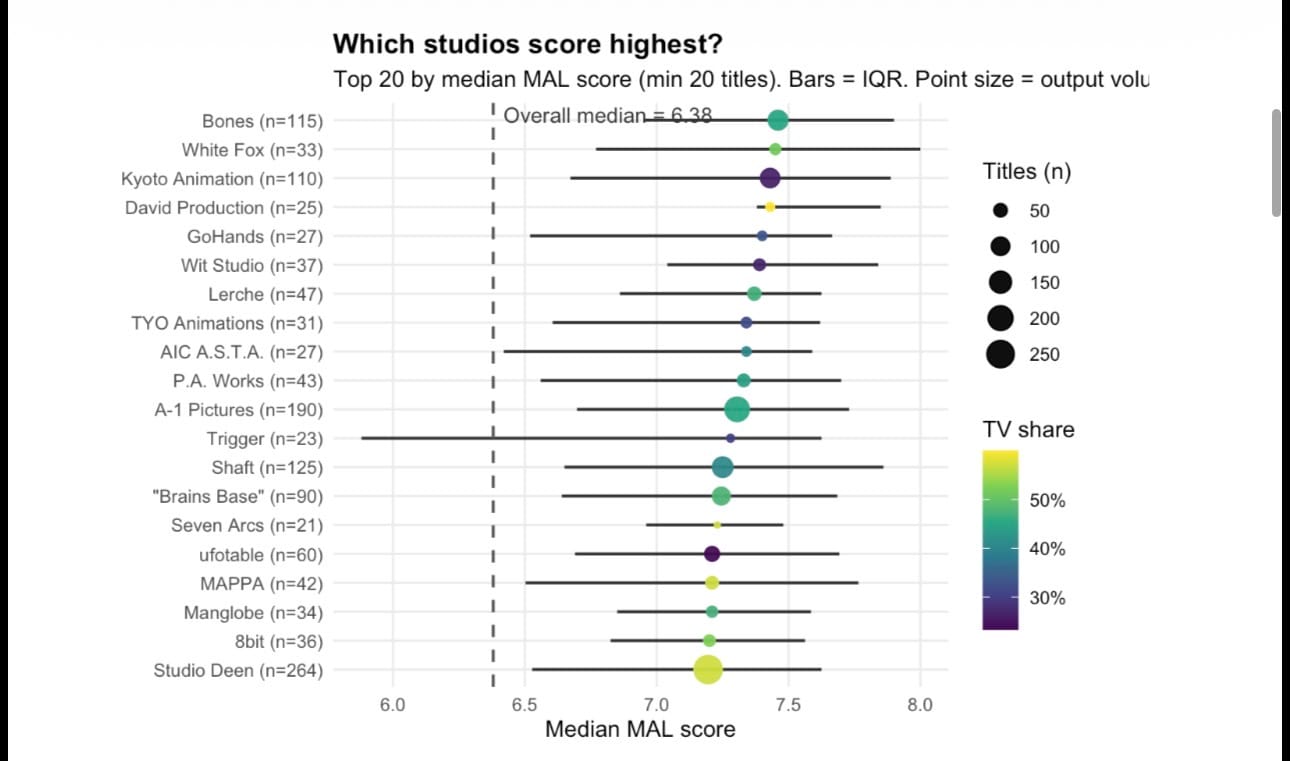
Chart 5 — Genre map — popularity vs well-rated
In this chart, each point is a genre tag (multi-label, so a single title can contribute to several bubbles). The x-axis is median MyAnimeList popularity rank (lower = more popular), while the y-axis is median MAL score—a rough proxy for attention versus reputation. In an “information-rich” environment, this distinction matters: as Herbert Simon argued, abundance of information creates a scarcity of attention, and the binding constraint becomes what people notice, not what exists. (People at Berkeley iSchool) The result is a cultural market where some genres dominate the atrium (high throughput, broad appeal), while others occupy quieter wings—sometimes still well reviewed, but harder to discover.
The dense middle cluster—Comedy, Action, Sci-Fi, Fantasy, Adventure—is the museumʼs main hall: large bubbles (many tagged titles) and solid but unexceptional medians around the mid-6s. Economically, that looks like a high-volume category ecosystem: when a genre is a production workhorse, it attracts more entrants, wider variance in craft, and more heterogeneous audiences. The median score settles into “reliably watchable” rather than “canon.” That pattern is consistent with entertainmentʼs hit-driven logic: large markets and scalable distribution tend to concentrate attention on a subset of titles (and creators), while the surrounding catalogue contains a long gradient of competence. In classic terms, the same mechanisms that create “superstars” also create a broad middle where output is plentiful but prestige is rationed. (Of (im)possible interest)
The table makes the more interesting point: high satisfaction does not automatically translate into mass visibility. Several genres score like prestige niches while remaining only moderately popular. Mystery stands out with a median score of 7.27, median popularity rank 3,297, and a 16.5% share of titles scoring 8+; Police follows with median score 7.18, median popularity rank 4,472, and 10.8% share 8+. These are the “curatorʼs rooms”: genres that may not be the loudest brand on the floor, but where the visitor who arrives tends to leave satisfied. Digital catalogues make this kind of pattern legible because they retain deep backlists and allow niche communities to accumulate—what Chris Anderson popularised as the Long Tail, where aggregate cultural value can sit far beyond the few blockbusters. (WIRED)
Your biggest “hidden-gem” signal is Historical—not because it is the highest-scoring category, but because it is comparatively under-attended. It has 964 tagged titles (7.1% of titles), a median score of 6.56, but a median popularity rank of 9,220, pushing it deep into the low-attention wing. This looks like a textbook “high-friction” cultural good: the theme carries prestige and depth, but it often demands more prior knowledge, patience, or tolerance for slower pacing—traits that are expensive in a competitive attention market. That attention gap is not merely organic taste; it can be reinforced by discovery systems. Research on recommender systems repeatedly documents popularity bias, where algorithms (and user feedback loops) over-expose already popular items and under-represent the long tail, compounding the visibility gap over time. (arXiv)
The chart also hints at how platform-mediated reputation differs from “objective quality.” MALʼs metrics are produced by a self-selected crowd, and the dataset itself comes from MyAnimeList via the TidyTuesday release, with titles lacking rankings or popularity excluded—so what you are observing is a structured slice of the platformʼs measurable universe. (GitHub) This is why genres like Kids can appear structurally disadvantaged: despite being large (2,158 titles; 16.0% of titles), it shows a lower median score (5.86) and a very small 8+ share (1.0%), consistent with the idea that rating cultures often reward complexity, novelty, and “prestige cues” more than simplicity or child-targeted design. In short, Chart 5 reads like a cultural-economics map of anime consumption: attention is scarce, reputation is unevenly distributed, and discovery mechanisms may systematically widen the gap between “what is well liked” and “what is widely seen.”
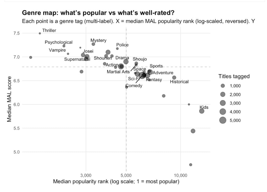
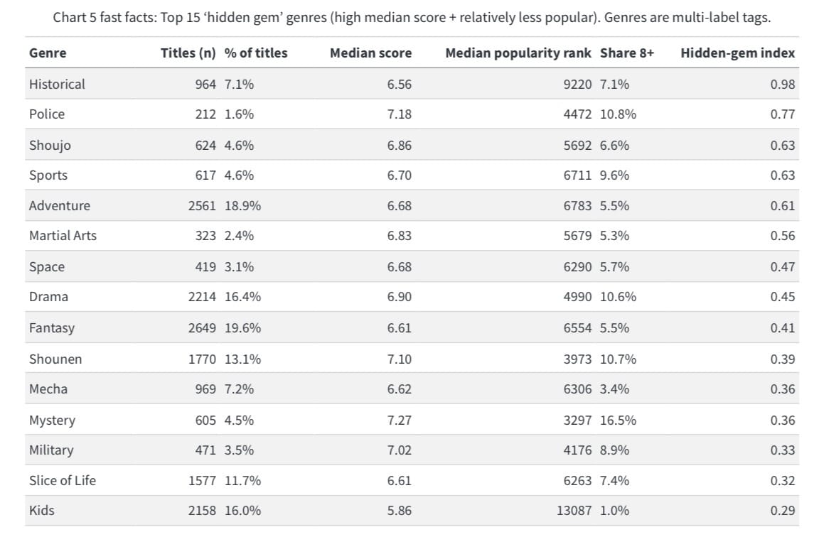
Chart 6 — Top studios (volume/credit ranking)
Chart 6A is best read as a production-capacity map, not a beauty contest. Studio credits are the anime industryʼs version of freight manifests: they tell you who repeatedly ships finished work through the pipeline—often across co-productions, outsourcing chains, and production-committee partnerships—rather than who produced the single highest-rated masterpiece. That framing matters because the table itself makes the point. Toei Animation dominates by volume (737 credited titles; 5.5% of titles) yet sits at a middling median score (6.68) and a low 8+ share (2.8%). In other words: Toei is systemically central without being uniformly “prestige.” That is exactly what youʼd expect in a global content factory built to deliver across decades. (Wikipedia)
Toeiʼs portfolio explains why. Its most visible IP (Dragon Ball, One Piece, Sailor Moon, Pretty Cure) is engineered for persistence—long-running serial narratives, evergreen characters, and a licensing model that turns animation into a renewable input for merchandise, games, events, and overseas distribution. That tends to generate mass reach and cultural stickiness (and therefore a very large credit footprint), while dragging down median scores simply because the catalogue contains everything from childrenʼs franchises to weekly long-runners to legacy seasons with uneven quality. In the attention economy, these are not “single-hit films”; they are infrastructural worlds that never stop producing new entry points for new audiences. (Toei Animation)
Sunrise (457 titles; median score ~7.00) represents a different industrial archetype: the “platform studio” tied to merch-and-media ecosystems—most famously Gundam—where anime is the narrative engine for a broader IP machine. The corporate structure reinforces the economics: Sunrise operates as a brand within Bandai Namco Filmworks, a consolidation that reflects how tightly animation, rights management, distribution, and licensing are bundled in modern anime capitalism. In cultural terms, this is the studio model that turns genre (mecha) into an enduring product category—collectible, expandable, and perpetually rebootable. (Wikipedia)
Then your “hit rate” metrics identify the prestige-weighted repeat players. Madhouse (share 8+ ~15.9%) and Production I.G (share 8+ ~13.5%) look like studios that are overrepresented in the part of the catalogue that becomes “canon”: thriller/psychological work, high-craft adaptations, and titles that travel well internationally because their premises are instantly communicable and their execution is tight. That mix raises the probability of strong ratings and strong secondary circulation—clips, recommendations, rewatches, and “you have to see this” word-of-mouth. Meanwhile A-1 Pictures stands out as the streaming-era profile: lower volume than the legacy giants, but unusually strong attention in your table (best median popularity rank at ~1,578 alongside a high median score ~7.30). Thatʼs consistent with modern fandom flywheels: light-novel/game adaptation pipelines, bingeable season structure, and global platform distribution that rewards studios capable of repeatedly producing clean, serial hits. (Cartoon Brew)
Finally, place this studio ecology inside the macro trend: the anime business has become a record-setting export industry, with reporting in recent years emphasizing overseas growth outpacing domestic and international revenue now accounting for a majority share in some summaries of AJA reporting. That helps explain why this chart is dominated by institutions built for throughput, franchising, and rights exploitation: in a world market, the winners are not only the studios that can make great art, but the ones that can reliably manufacture repeatable cultural products at scale—characters, worlds, and formats that convert attention into durable IP. (AUTOMATON)
1: https://en.wikipedia.org/wiki/Toei_Animation?utm_source=chatgpt.com “Toei Animation”
2: https://www.toei-animation.com/?utm_source=chatgpt.com “Toei Animation: Homepage”
3: https://en.wikipedia.org/wiki/Bandai_Namco_Filmworks?utm_source=chatgpt.com “Bandai Namco Filmworks”
4: https://www.cartoonbrew.com/anime/japans-anime-quality-crisis-258238.html?utm_source=chatgpt.com “Inside Animeʼs Quality Crisis - Cartoon Brew”
5: https://automaton-media.com/en/news/overseas-anime-market-growth-continues-to-outpace-domestic-market-gap-in-revenue-expected-to-grow-industry-research-shows/?utm_source=chatgpt.com “Overseas anime market growth continues to outpace …”
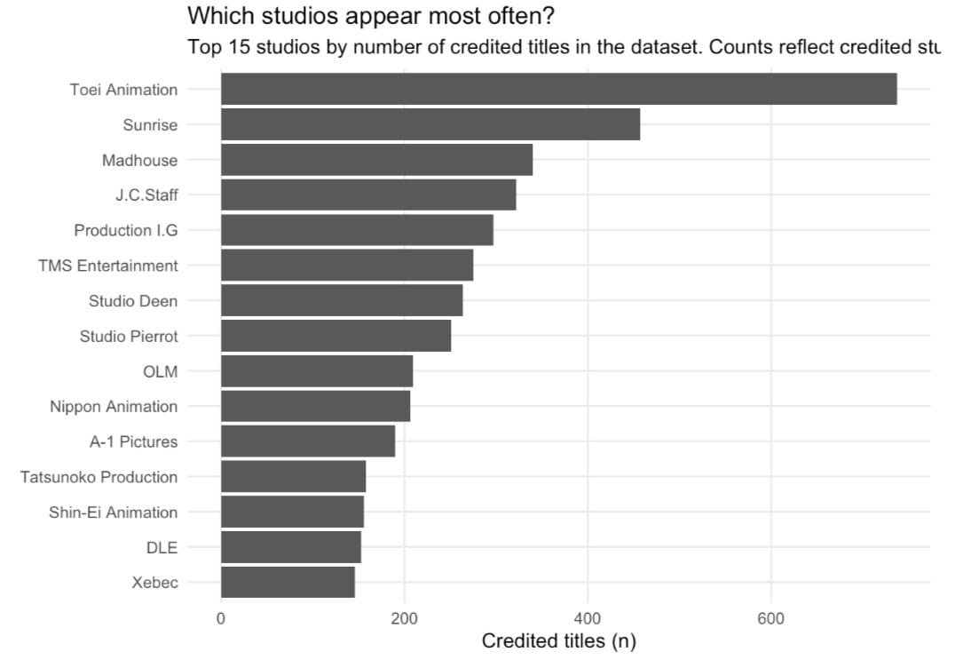
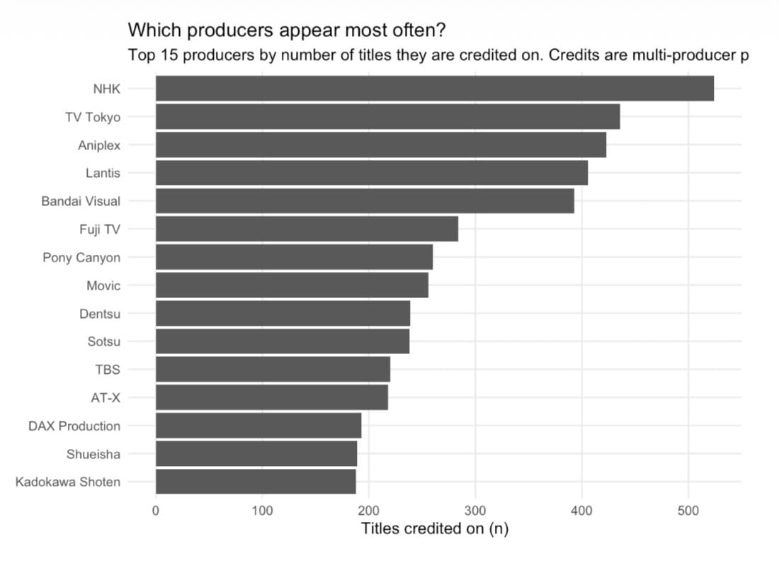
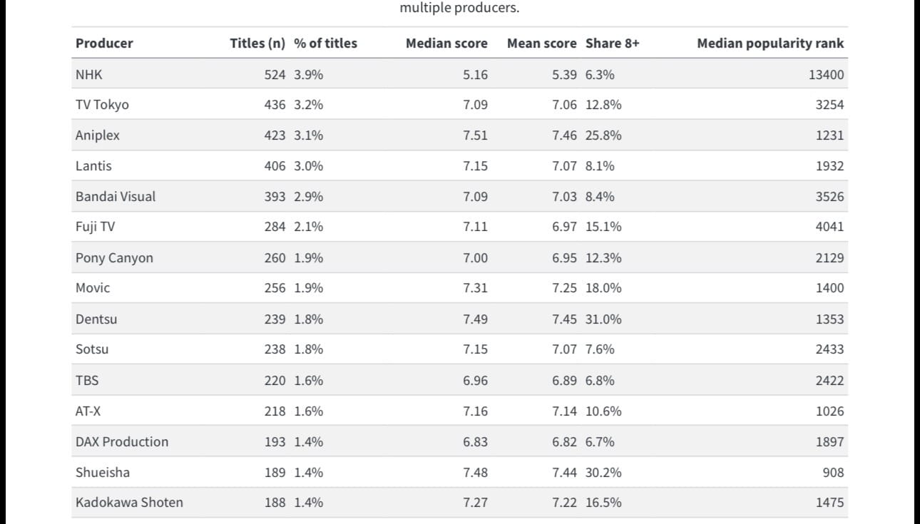
Chart 7 — What the “producer” leaderboard is really showing
Chart 7 is less a creativity ranking than an institutional map. On MyAnimeList, “producers” often mean the production-committee layer—broadcasters, music labels, publishers, ad agencies, and rights-holders who assemble capital, buy slots, coordinate marketing, and monetize downstream (music, home video, games, merch, international licensing). In other words: the storyworlds look wildly diverse on the surface, but the financing and distribution machinery is comparatively repeat-player heavy—a pattern thatʼs widely described as the production committee system in anime. (Crunchyroll)
Your table makes the split visible. NHK leads by credited titles (524; 3.9% of titles) but also has the weakest audience-score profile (median 5.16, median popularity rank 13,400). Thatʼs a clue that “producer” can mean public-service/broadcast output (education, childrenʼs, informational, domestic scheduling needs) rather than a global fandom hit machine. Meanwhile, the entities most associated with commercial hit-making—Aniplex (median score 7.51, popularity 1,231, share 8+ 25.8%), Dentsu (median score 7.49, popularity 1,353, share 8+ 31.0%), and Shueisha (median score 7.48, popularity 908, share 8+ 30.2%)—sit lower in raw count but far higher in “attention efficiency.” Thatʼs the economics: one model optimizes for throughput and scheduling, the other for blockbusters and IP compounding.
This is where anime starts to look like a modern IP supply chain. Publishers such as Shueisha (the Weekly Shōnen Jump ecosystem) repeatedly appear because they control the upstream asset—manga IP that already has proven demand—so the committeeʼs job becomes scaling that demand into animation, music, merchandise, and global licensing. (Dentsu-ho) Likewise, Kadokawa Shoten shows up as a classic “media-mix” architect: a company structured to create and circulate IP across formats, explicitly framing its strategy as a Global Media Mix approach. (KADOKAWA) In cultural terms, these producers are not just backing “shows”; theyʼre running franchise portfolios where each adaptation is both a product and an advertisement for the wider IP estate.
Music-label producers in your top 15 reinforce that point. Aniplex is literally positioned as an anime-focused entertainment company inside Sonyʼs group, and its incentives naturally reward series that can be monetized as soundtracks, openings/endings, live events, home video, and games—a pipeline where music is not decoration but a revenue rail. (SME) Lantis and Pony Canyon appearing high on the list tells the same story: animeʼs “front end” is narrative, but a meaningful share of the business model runs through songs, albums, and talent tie-ins, which also helps explain why certain titles go viral—short, repeatable audio hooks and theme songs are built to travel.
Put differently, Chart 7 reads like a museum placard for the hidden architecture of modern fandom: broadcasters (NHK, TV Tokyo, Fuji TV, TBS, AT-X) provide distribution chokepoints; publishers (Shueisha, Kadokawa) supply pre-validated narratives and characters; labels and entertainment arms (Aniplex, Lantis, Pony Canyon, Movic) industrialize music/merch; and ad/marketing firms (Dentsu) specialize in scaling attention. The tableʼs strongest signal is not “who makes the best anime,” but who owns the levers that turn stories into repeatable, exportable assets—and why the same names recur across thousands of titles in a market that appears, on the surface, infinitely varied. (Crunchyroll)